


If you design a mobile app, whip out your phone and look at your home screen. Really, just do it now! Where do you expect your app to interact with your users?
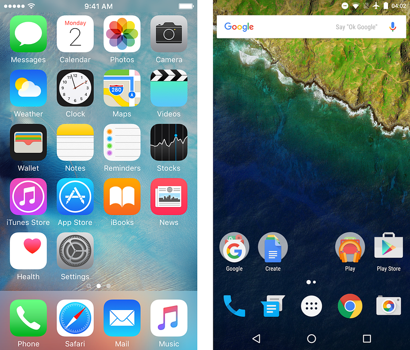
You probably were looking at your app’s icon. You are building the app after all, you expect or at least want your users to start your app and use all the awesome features you designed. Maybe you even looked at the notification area thinking about those push messages marketers were sending. One about a recent new feature and one every time the user has a new follower on her profile. But there are a few other channels you could think of: email (for sending forgotten password emails), SMS (when the security team succeeds in convincing the PM to implement two factor authentication) or even a chat interface with bots (maybe you could experiment with those conversational interfaces in your next design sprint).
In either case, all of these channel should be working together and have a unified great experience if you want more engagement, more returning users, and a successful app and business.
Why Engagement Matters
Getting people to download your app is generally not that hard. There are plenty of proven marketing strategies for that. If your app answers a human need, is built upon a validated hypothesis, and executed well, you just have to create a nice app page, throw some money on SEO and there you have a few hundred thousand downloads. The issue is how to get people to actually use your app and discover all those nice features you have designed.
Most apps downloaded don’t even get a chance, as 25% of apps installed will never get started. You have very little way of reaching these people, and this just shows you what vanity numbers like downloads tell us about success – almost nothing.
Even if your app does get started, 23% of apps are only used once. This can mean several things:
- The app’s capabilities and the user’s expectations raised by marketing does not match.
- The user is forced to use the app to complete a one time action. Maybe the users don’t need an app at all, but a better mobile web experience.
- The app is not habit forming. There are very few apps (and even fewer 3rd party apps not coming from major players like Facebook) which can achieve regular use. Regular use is hard, 62% of the apps are used less than 11 times. And you do want people coming back: retention rate is one of the basic pirate metrics that shows how a business is doing, and you usually want the highest number of returning users.
All three of these are design issues, you have to collaborate more with marketing (align your messaging already!), with business (at least know your business model), and design your app in a way that it actually enables people to discover the app’s features, and keep on using them. But designing awesome screens alone is not enough. Enter messaging.
As a side note, there are a few apps which don’t actually need any messaging to see a record number of returning users, for example Pokemon Go, even with falling numbers they are still doing great, or Neko Atsume. So unless your app is built on a huge IP or it contains cats, read on.
Effective Messaging
Messaging is like any other UI element in your app, it should support the experience of the app. Also like any other UI element, it should be a consistent part of the flow. There are just too many apps where it’s plainly visible that messaging was not part of the original design, just added latter.
The trickiest thing about messaging is using the people’s attention effectively. Human attention is a finite resource and I believe it’s the duty of designers to use this resource the right way (or indeed any human resource, like memory or focus). Meaning you should work with this resource with consideration, give a meaning to every interaction and make sure to not overdo it.
To achieve consideration, every message should follow a few broad guidelines:
- Relevant: it should be something that the users would actually care about and adds to their overall experience. Many apps try to force their way into your life without adding anything interesting (trending messages from Twitter, ring a bell?), like begging for attention. Relevancy comes from content, it should be both have some actual substance and designed in a way that helps digesting it.
- Personal: meaning the message should be tailored for the user getting it. Sometimes this just means actually using the user’s name, other times it’s an information piece created just for the user or something based on the user’s behavior. The hard part on getting personal is that the users have to also perceive the content as personal. Many algorithmic personalizations, while working well, are not designed with empathy or even with common sense. Remember that one time when you looked at a bag on a website? Now you get bag ads forever.
- Contextual: the message coming at the right time, may be at the right place or even on the right channel. Getting notified about a trending festival while you are working is annoying. Getting notified of storms a few hundred kilometers away is useless. Getting a sale newsletter at the end of the sale is too late.
- Actionable: the user should be able to do something with the message she gets. And the action inside the message should be effective, so the user should be able to actually do what the action called her to do.
- Opting out: this method should be available in some form. Most messaging channels provide a way of opting out for the users that you have no control over, like sending your email to spam. It’s better to get proactive and give the choice to your users and maybe retain some form of messaging options for latter.
To get started with messaging you should choose the right channels for your app.
Stats seem to vary a lot, and usually depends on your industry, but here are some examples:
- 70% of emails opened on mobile
- 50% open rate on mobile
- 3.3% click rate (2.7% for non responsive)
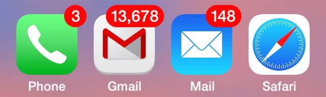
Even before mobile, services used email to keep in touch with their users. Usually the email address is the first piece of contact information that you learn about your users, and since it’s so ubiquitous, it’s also easy to ask for permission to stay in touch. This also means that most people get too many emails, so important messages may go without getting read.
Due to the few design restrictions, there are plenty of ways to make emails personal and actionable. But it’s hard to make emails really contextual, even the shortest email may not be read at the right time or at the right place. So it’s better to only send emails that don’t really depend on when and where the user will open it.
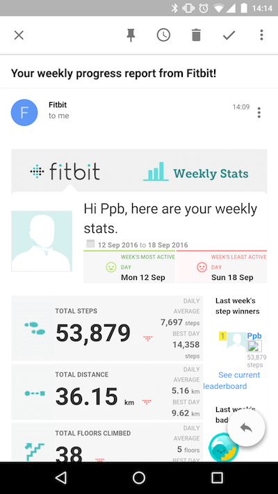
Emails are great for sending out product news, weekly updates, summary of activities, and information intended to be kept for latter reference by the user.
Tips for designing email messages:
- Subject line matters, even more as on desktop. Mobile email clients tend to display less characters (25–30) so the first few words should be very focused and make it clear what the email is about.
- You have to use responsive design, there is now way around this. Especially if the email is part of the app workflow. Here is a great article to get you started by Joe Munroe.
- Limit the length. Since there is no limit on how long an email can be, it’s too easy to keep on adding words, sentences and call to actions. Keep in mind that the longer the email the less likely it gets read in time. Remember when you last thought: “I don’t have time right now to read this, I’ll just keep it in my mailbox and read it latter”? Especially transaction emails should be understood at once.
- Make sure to test your email on most mobile clients before sending.
- Mobile email doesn’t work well with big images, so if you intend to keep that one huge hero image, make sure your email is also understandable without it.
- For clickable areas use the same size as you would use for any button on the app UI. You don’t want the user to fail tapping that tiny link.
SMS
SMS design is also important for engagement. The statistics surrounding it are astounding:
- Open rate: 98%
- Click through rate: 36%
Texting as part of a service has existed for quite some time (remember when we used to get weather forecast via SMS?), and for example emergency services still use it to reach people when necessary. The biggest advantage for texting is that you don’t even need an app to send timely messages to your users. On the other hand the limitations of the format means you need to have a really well-written copy.
Besides using SMS for messaging recently, services started to pop-up built solely on texting. Digit is a savings service that does most of it’s communication via texting (although they have apps too). Cloe is recommendation service for local businesses. DirtyLemon is a company serving lemonade, where all customer interactions run over texting. They are examples showing how apps can be designed only based on conversation.
SMS is great for sending highly critical and time sensitive information, and when internet may not be available, for example travel information.
Tips for designing SMS messages:
- Even though you can send multi-part SMS with images, each message you send costs you (and in some cases even your customer) money, so consider the length, especially if you use personalization (first names can be any length) or link as a call to action.
- Just like with other messages the first few words count the most as people will see them first in their list.
- Unlike other forms of messaging, phone numbers can change owners. Make sure your sending critical information to the right person.
Push
Push notifications can help you cut through the noise and the numbers around them suggest they work.
- Opt-in rate: 50.2%
- Open rate: 10.2%
With the average smartphone user having 50+ apps, even regular use of an app won’t necessary start with a tap on it’s icon. Many uses, like your friend answering your earlier message or your food delivery arriving, will happen via push notifications. They can be highly contextual, targeting an exact time, place (or for that matter any sensor that a device has, like the owner going to fast), or the opposite, like not sending updates that can wait while the owner of the device is asleep.
With push notifications there are huge differences between the platforms regarding permissions and interactions. iOS and Android do things differently. iOS and Android convert differently. Know your guidelines for both platforms. Before diving into the details, check guidelines on the platform documentation:
Push notifications are great for sending transactional messages that require the user’s action to continue and highly contextual information, that may depend on time, certain place, or any other device sensor.
Tips for designing push messages:
- Use the platform’s capabilities, like embedded images on Android and available actions, for many actions the user doesn’t even need to open the app, like quick replying a message.
- You can set up push messages to vibrate, but only do it for really important information.
- Think about how your message will look like among other messages. Will it be important enough that the user would decide to open it, or will it be just cleared without getting read?
This is an excellent article on push notifications by Noah Weiss from Slack.
Chat bots
As chat services turn into platforms, more and more apps appear as chat bots. I think of these as the next level of texting services (and also as beefed up IRC bots). There are examples already in Asia how this would work.
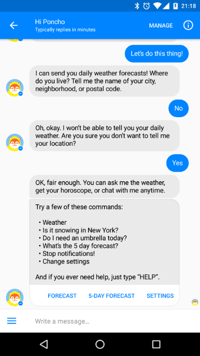
Conversational interfaces evolve towards a new interaction paradigm, but right now there doesn’t seem to be a huge difference compared to how other type of messages need to be designed.
Tips for Designing Engaging Messages
Knowing your channels and having a plan on how to use them should already help. Here are a few tips to get you started designing better messages.
- Do your research. To know what messages would be important for the users, and how the messages fit into their daily routine you should go out and talk to your customers. While this is also important for the whole design process, interviews and field studies can uncover new scenarios where messaging will be important.
- Design your story. Just like with the app design, storytelling helps summarizing research facts, identify contextual information, and push these throughout the design process. A journey mapping or a story mapping exercise helps visualizing they story and uncover further message touch points.
- Have a copywriting guide. Just like having design principles for designing a UI, you should also have guidelines for writing words to have a consistent tone of voice. A great way of doing this is to have a product stance, a personality for your app. For smaller apps this doesn’t need to be a full persona, a few statements what would your product do should suffice.
- Deep linking. A message with an action should be like an open door to your app that invites the user inside. So make sure if you invite the user to the living room, she doesn’t end up in the kitchen. If you send a push to the user about a feature, taping the message should bring the user straight to that exact point in the app where the feature is.
- Design with data. To achieve real personalization, designers should learn to use the data available. Never use placeholder text and dummy data if you have real data available as it may look different than what you expect. Even if the users don’t input any data about themselves, there are still many things you can use, like app usage patterns, date and time, other sensors. These may all influence what messages you can send. And also be prepared if you have missing data, dear <first_name>.
- Use automation. When creating messages, automation can help to implement complex strategies on when and what messages should be sent. Besides the messages itself, design also the rules when to send (and when not to send) messages.
- Context, context, context. Context matters. Do you really think that new follower interests the user when her phone is on 5% battery? Why not wait until the phone is on charger again? While research should uncover lots of interesting scenarios, a source of true delight is when you can anticipate and resolve the user’s anxiety.
- Measure the effects. With messages you should measure not just open rates, but also actions taken and unsubscribes or even uninstall rate. These may uncover problems where additional iterations will be needed.
- First impressions count. Make sure your first message is great, as it will set the expectations for the rest of your messages. It’s easy for users to loose interest and opt out from further communication.
This article was written based on my talk at MobileWeekend 2016.
This post originally appeared on the Emarsys Craftlab blog.


